20 UX Design Examples: Industry Standards to Learn From


With a myriad of UX design examples out there, we are able to evaluate what makes or breaks user experience. In our article, we will compare good practices that enhance UX design and bad features which hinder the user’s experience.
UX design plays a vital part in how successful and well-received your digital product will be. With high-quality UX design, users tend to spend more time interacting with the product, which creates a positive perception of the brand and encourages users to return.
Good UX design makes a digital product intuitive, enjoyable, and easy to use. Many positive UX design examples are built by understanding user behavior and providing consistency in design elements to maintain clarity of navigation.
On the other hand, bad UX design leads to frustration, confusion, and can possibly result in a user abandoning the usage altogether. Bad UX design examples usually demonstrate cluttered or inconsistent design, which makes it harder for users to efficiently find what they are looking for.
To help you better understand and visualize the difference between poor and high-quality design, we will examine the key features that affect the user experience.
By looking at several good UX design examples, we will break down elements that some brands implement into their design that contribute to a favorable user experience, such as:
- Simplicity,
- Consistency,
- Accessibility,
- Personalization.
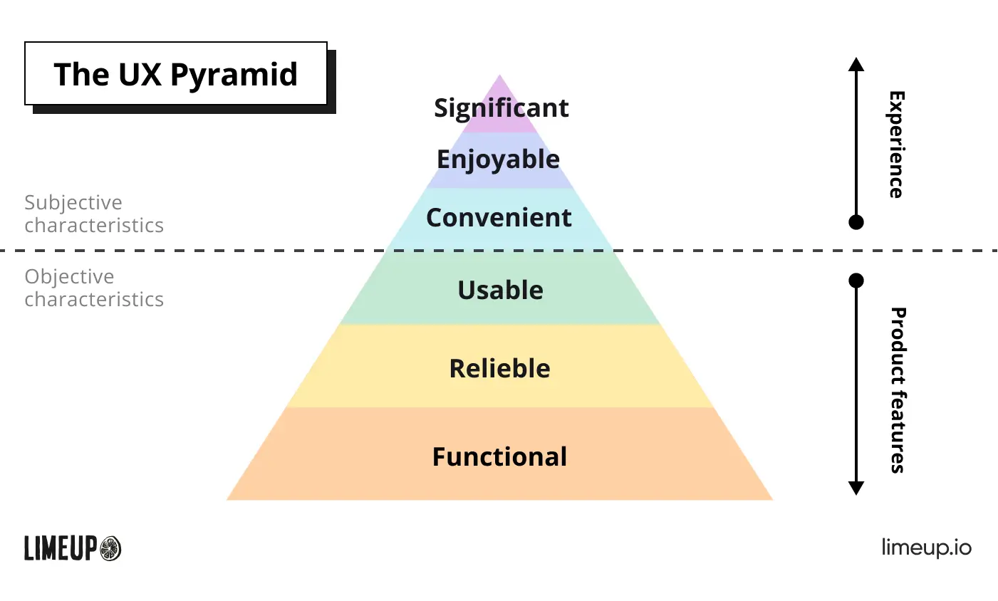
The UX Pyramid.
We will also dive into common bad UX design elements that negatively impact the user’s perception and harm the overall experience of using the product, namely:
- Poor navigation and usability,
- Complicated onboarding process,
- Non-responsive design,
- Confusing forms,
- Too many pop-ups.
Understanding these crucial details between good and bad design and conducting user research will help you make informed choices. As well as create your digital product to meet the user expectations and user needs of your target audiences.
It’s also important to partner with reliable UX designers that have knowledge of how to combine the specific requirements of your project without compromising on crucial design features.
Sometimes, entrepreneurs may not realize that what they are looking for may possibly not be realistic to deliver. So, it’s vital to stay on the same page when it comes to designing the user experience and creating a product that will be distinct from others on the market.
At Limeup, we have extensive expertise in creating impactful UX designs. Our UX designers are focused on delivering on the requirements of our clients and incorporating essential design elements that positively reflect on the user experience.
Without further ado, let’s jump right into examining UX design examples that you can take inspiration from and adopt the features that make these digital products stand out against the competition.
Good UX Design Examples
There are a lot of nuances that make good UX design examples stand out against competitors. Leveraging our extensive experience as a UX design agency in London, we meticulously analyzed 15 examples of brands that focused on creating outstanding UX design.
In this article, we will explore what makes the following 15 examples actually good:
Airbnb — positive user experience

The company is widely known for having a clear and simple website. Users who visit the website for the first time have no issues navigating and completing tasks easily. This makes Airbnb an illustrative UX design example that was done right.
A few prominent good UX design features include:
- The home page. In front of the user is a catalog of several options, making the purpose of using the service very clear. Users are unlikely to get confused at the stage of first acquaintance, so the choice of such UI/UX design elements is a definite plus.
- Search. Users take minimum time to familiarize themselves with the offers. Visitors can choose the filters they want that will actually be useful and take them to the right offers. Unlike other similar services, the filtering system consists of necessary and demanded options.
- Map. To explore the options, it is enough to open the map and select a location. These two actions make it even easier for a user to choose a vacation spot. The map is simple and intuitive, so visitors avoid difficulties while using the service.
What Airbnb does right is its focus on continuous evaluation and eliminating complexities. Switching to a simple use allows you to captivate the user for a long time and keep them coming back to use the service again. Adopting such examples and practices can guarantee growth in credibility.
Additionally, the improved design of the pages has led to an increased demand for the services provided in recent years. We can see that the popularity of the service is growing, setting a notable example of well-minded UX design.
Youtube — innovative UX design

Youtube is no doubt the biggest video hosting platform available right now. Its major popularity is partially due to implementing some of the most efficient key features and focusing on user needs.
Among the main features that Youtube uses in its good UX design are:
- Sidebar navigation. Located at the left side of the screen, Youtube presents a comprehensive sidebar navigation where users can easily find their subscriptions, history, liked videos, and more.
- Recommended videos. Analyzing previously viewed videos, subscriptions, and likes, the platform provides a selection of other videos that may be of interest to users. It’s a great UX design example of using algorithms to lead users to relevant content and ensure they continue using the service.
- Playlists. Youtube allows users to create custom playlists so that they can watch videos in their particular order or theme.
Overall, Youtube is a bright example of personalization that greatly benefits the service. Of course, there is more of what the platform does right, but Youtube’s data collection and usage of algorithms to connect the user to relevant content are the most notable.
Its simple design and intuitive interface allow them to capture a wide range of demographics and audiences. Meaning that even children and elderly people won’t have an issue using and enjoying the service.
Grammarly — good UX design

Grammarly is another great example of how even tools can benefit from mindful UX design. Working with the service doesn’t require a constant visit to the site, as it’s an offline extension, so it’s definitely a unique approach to the user experience.
Major advantages that make Grammarly one of the examples of good UX design are:
- Real-time suggestions. The biggest attraction of Grammarly to its main audience is the ability to have your text analyzed in real-time. The tool works in the background as users type and instantly checks for spelling, grammar, punctuation, and even stylistic errors.
- Settings. Customizable settings are also a great advantage and element of UX design that sets the tool apart from its competitors. Users can choose their preferred writing style, such as general, business, academic, and more. Additionally, they can set their writing goals and language preferences.
- Accessible on multiple platforms. Since Grammarly is available as a browser extension, a desktop app, and a mobile app, it allows users to continue using the service from multiple devices. The tool is well-optimized for all its platforms, so users avoid facing any cross-platform issues.
Among many examples, the service can also detect frequent use of the same phrases and passive voice. Detailed explanations help to get rid of the detected flaws, taking into account the current rules.
A simple and clear interface created by UI designers ensures users won’t get confused about how to use the extension. The many advantageous features of this tool attract not only regular users but also people who are learning a new language and may need more help to use it accurately.
Google — responsive design

Being the most used search engine in the world, Google put a lot of effort into creating a good UX design and engaging user experience. Regular UX review and simplification of the search engine, and removal of unnecessary elements allowed the service to remain popular and almost monopolistic.
The highlights of its key features include:
- Search bar. The search bar of Google has become a staple in modern days, especially captured in a phrase like “Google it” when someone has a question that needs to be answered. With a rich amount of data collected, the search bar is prominent with its autocomplete feature, which allows users to type in their queries more efficiently.
- Search results. Another major factor in Google’s success is the abundant search results page. Beyond providing users with links to relevant articles and sources, it also presents them with snippets of information, images, maps, and more. This makes the process of finding the right information more effective.
- Extensions. Nowadays, Google provides comprehensive services beyond a simple search engine. With tools like Google Maps, Google Drive, Workspace, and more, users can access an interconnected hub of information. What they all have in common is a clear and intuitive UX design.
Google’s products are developing in sync, and the improvement of one often leads to the improvement of another. The focus on simplifying complex tasks makes the service one of the giants in the tech industry and one of the best examples of UX design.
PayPal — onboarding experience

The demand for efficient and secure payment systems didn’t go unnoticed by PayPal. The company took into account the main problems and concerns of users and solved them for the convenience of their customers.
PayPal earned its place as a good UX design example as a major payment system in the world by implementing several positive user experience examples:
- Onboarding. The user friendly onboarding process of PayPal helps users who are using the service for the first time to get started without a hassle. Straightforward and clear instructions are allowing users to sign up quickly and begin interactions.
- Dashboard. An uncluttered dashboard with understandably labeled icons guides the user around the platform easily. The information about their cards, payment history, balance, and more, is visible at a glance.
- Payment options. PayPal integrated a few payment options to elevate the convenience of using the service for users. What’s notable is that PayPal provides clear information about commission fees and charges when customers use options like bank transfers and PayPal balance.
By putting necessary and useful information at the front, PayPal evades the need to focus on pages with frequently asked questions, as well as avoiding leading the users to constantly use support.
Apple — accessible UX design

Apple is a bright example of the decades-long transformation that modern phones have gone through. Achieving such worldwide success wouldn’t be possible without taking into consideration many useful features.
The brand achieved such high results in the industry by leveraging good UX design features such as:
- Consistent design. All of Apple’s products have a consistent design, using the same types of UI elements, color schemes, icons, gestures, and more. This is allowing users to get quickly acquainted with the new device or product.
- Accessibility. Apple pays a great deal of attention to user needs and makes its products accessible to all people. Helping people with disabilities to interact with their products, Apple provides features like voiceover, flash screen, closed caption, assistive touch, and much more.
- Customization. The company provides its users with a wide range of customization to set their devices to their preferred styles. With a unique selection of fonts, colors, and designs, Apple gives users the option to change almost everything they can imagine.
The combination of a simple interface and space for major customization creates a comprehensive experience for users. This highlights well-handled UX design on the part of the company.
By taking care of all of their users’ needs and demands, Apple’s products continue to draw many new fans in. This demonstrates their determined UX strategy and marks them as one of the best UX design examples.
Spotify — customer satisfaction

Spotify is among the leading music streaming services due to its abundant features that attract many users for its convenience and user friendly design. The intuitive UI design also declutters the pages and makes focus on creating a seamless experience.
Some of the best examples of UX design they use include:
- Personalization. Similar to Youtube, Spotify collects user data to present them with a personalized selection of music based on their past activities. It also provides an option to create customized playlists.
- Social sharing. One of the elements that make Spotify so popular is social sharing. Users can create playlists that can be shared and edited by friends and other users. The platform also has an integrated ability to share favorite music on social media accounts.
- Offline use. The ability to listen to your favorite music anywhere and anytime, even without an internet connection, puts a major advantage on Spotify. Users can download their favorite tracks and access them offline.
During the discovery stage of the platform’s UX design process, Spotify decided to expand the features by implementing podcasts in addition to streaming music. This way, they expanded their reach of potential users and drew more creators to use the platform.
Overall, Spotify shows great dedication to keeping their users engaged and sets a notable UX design example for other services in a similar field.
ASOS — enticing online shopping experience

Being in a highly competitive industry like retail, ASOS had to put a lot of effort into its UX design to stand out. By looking at various UX design examples from other clothing brands, the company took inspiration and combined all the best practices into their store.
ASOS engages users with good UX design innovations such as:
- UI design. UI designers created a clean interface with a lot of whitespaces and simple typography that accentuates ASOS’s fashionable and responsive design, putting forward its products. This approach allows them to avoid overwhelming the customer with too many options or attention-grabbing elements, which helps streamline their experience on the site.
- High-quality imagery. One of the main attractions of the store to customers is its abundant use of high-quality imagery that helps the users to evaluate items in the smallest details. In addition, ASOS utilizes 360° views as well as adds demonstration videos to some of the product pages.
- Search. The store uses autocomplete search queries to help the process of finding the desired items. Users can also make use of search filters that include a choice of style, color, and other characteristics to reach the products they need.
Having a wide selection of products, ASOS understood that the users would need an improved search process to find and choose the most suitable products for them. By creating a seamless user experience, the company proved that exhausting the customer to order is unnecessary.
Medium — advanced filters

Medium’s website is known to be informative without being overwhelming. As a publishing platform, users are offered to evaluate the content of pages once they land on the website. And their strategy seems to be working, considering that millions of users are registered at the service.
The key features they use to achieve a good UX design example are:
- Filters. Medium provides a good selection of filters to help readers discover the information that they are looking for. Articles are divided into several categories, so it is easy to find useful articles and blog posts.
- Reading list. The reading list lets users save articles that they are interested in to read later. This feature also has the option to access the information offline, which majorly simplifies the user’s experience.
- Recommendations. Based on previous reading history, Medium selects similar articles and suggests them to users who may have an interest in them. The “Trends” tab also showcases popular and frequently read articles that may interest the user.
In addition to its features, Medium informs readers about the amount of time it takes to read the material. While the determination of time is relative, this feature still considerably simplifies the readers’ life.
In general, Medium found a balance between providing highly informational content and maintaining a clear and concise UX design.
Notion — engaging user experience

Without a doubt, Notion’s main attraction for users is its immense personalization options. With many other work collaboration tools on the market, Notion recognized the need for a customizable approach to work effectively.
As a good UX design example, they’ve implemented features like:
- Customization. Notion lets users arrange Kanban boards and templates to fit their needs. This allows users to organize their workflow in a way that makes sense to their workflow.
- Collaboration. To let users collaborate with each other on projects, Notion offers real-time sharing options, such as task assignment, commenting, and sharing.
- Drag-and-drop options. With simple drag-and-drop features, users can organize their framework by dragging content like images, files, and texts to manage the user’s own database.
As an original addition that attracts visitors to the service, Notion created the ability to set up unique characters for each user. It also introduced a useful notification system that notifies users when the project deadline is coming up. This helps avoid the issue of missing the project completion dates.
An excellent onboarding process will enable users to get started fairly quickly and not get lost in a wide range of available features.
Netflix — suggestions

As one of the most popular movie streaming services, Netflix had to put a lot of effort into considering the user needs to remain as competitive in the market as they are. Paying attention to user feedback allows them to continuously improve user experience, which results in overall great UX design.
The good UX examples they use in their features are:
- Autoplay. This feature can enable users to binge-watch their favorite TV shows by automatically playing the next episode. It eliminates the need to manually switch to the next episode and encourages users to keep using the platform without distractions.
- Continuity. The continuity of watching feature lets users pick up watching the movie or an episode exactly where they left off, even if they switched the device where they watched. This element of great UX design elevates the need to remember where users stopped watching and continue without a hassle.
- Recommendations. Similar to other streaming services, Netflix collects data from multiple users with similar interests and presents a curated recommendation list of the content that may be of interest to each particular user.
Each time Netflix introduces a new feature or updates an existing one, it is supported by extensive research that proves customer interest. This allows them to innovate their approach and guarantee its success.
By keeping a steady focus on simplicity and convenience, Netflix managed to attract millions of users across the world.
Another notable UX design example they’ve implemented is taking accessibility into consideration. The platform created an inclusive environment for all viewers with features like assistive listening, screen readers, and closed captions.
Nielsen Norman Group — written information

Nielsen Norman Group achieved a reputation as a reliable UI/UX consulting company through its extensive expertise in user behavior and knowledge of the market. Founded by pioneers of modern UX design, Don Norman and Jakob Nielsen, the company is regarded as one of the most influential in the field.
Their effort translates on the company’s website through good UX design examples like:
- Homepage. The homepage of the website is noted to be very informative. Upon landed, users are presented with useful articles about the intricacies of UX design, demonstrating the brand’s expertise in the field. At the top, users can find call-to-action buttons that allow for quick access to their services.
- UX writing. Understanding their target audience and how to engage with them, the Nielsen Norman Group’s website uses cohesive and simple language in order not to confuse the users with difficult terminology. Easy wording resonates with potential clients and establishes an effective contact from the get-go.
To further capture the user’s attention, Nielsen Norman Group’s website provides a portfolio of works that proves their competence in the market of UX design. Visitors don’t have to guess what’s behind the famous name, making it more likely to continue interacting with the site.
Behance — aesthetically pleasing

As a platform where you can view creative works and hire UX designers, as well as apply for a job as a freelancer, Behance had to develop an appropriate design so clients could use the service hassle-free.
Being a good UX design example, Behance focused on improving key features such as:
- Navigation. At the top of the homepage, the brand presents users with a clear navigational hierarchy. Using drop-down menus, users can filter their search by multiple categories, such as fields of work, tools, location, and more, to find precisely what they need.
- Accessibility. To accommodate users with different needs, Behance uses descriptive text and tags, as well as providing a resizing text feature, to help visually impaired users navigate the content better. The website is also optimized for different kinds of devices, making it easy to access no matter which method the user prefers.
- Visual design. Since Behance is a design platform many freelance designers use as their online portfolio, the visual design also had to be on point. The use of whitespace, simple layouts, and bold typography attracts users and helps them navigate the website more efficiently.
Connecting designers and employers is the main purpose of Behance. This is why they paid a great deal of attention to creating a consistent and simple UX design to ensure the collaboration process is enjoyable.
The platform also hosts relevant job postings that make connecting with employers easier. Using the platform elevates the need to spend time on third-party resources, which is an important benefit.
Confluence — design principles

Similar to Notion, Confluence is a tool for teamwork that helps organize the workflow of multiple team members. A team workspace must be convenient and intuitive so that the collaboration process remains streamlined and systematized.
Confluence has a solid understanding of the demands of their target users, so they’ve incorporated good UX examples into their tool, namely:
- Customization. The ability to customize the layout and templates of the page is one of the main attractions of Confluence. Adding custom text, images, and other types of multimedia elements helps create a workflow that is suited to the specific needs of the team.
- Visual interface. The visual interface of the platform is also notable. Mindfully using whitespace and simple, yet attractive, icons create a more intuitive navigation structure and minimize the chances of confusing the users.
- Accessibility. Having accessible UX design is now a standard in the field. Confluence didn’t overlook such features and introduced screen readers, color contrast, and keyboard navigation into the platform.
Focusing on convenience and usability, Confluence attracted many users to the platform. A well-designed user experience contributes to a smooth workflow and makes it a popular choice for team collaboration software for many companies.
Miro — team tasks

The last, but not the least important UX design example on our list is Miro — a platform designed for the simplified organization of work processes. Using the service allows users to coordinate the actions of each team member.
They leverage the benefits of the following UX design features to stay popular with users:
- Intuitive navigation. Miro presents a clear navigation hierarchy with knowledgeable use of white space in combination with bold colors to help guide new users as they learn to use the platform. Like many other teamwork tools, Miro gives user permissions to completely customize their boards and templates to fit their work needs.
- Integrations. The platform provides integrations with a wide variety of third-party software, such as Google Workspace, Microsoft Teams, Jira, Slack, and much more. This helps streamline the work process between multiple team members.
- Collaboration features. To make sure that the collaboration process between employees is consistent and smooth, Miro provides several methods of communication. Users can invite other members to join their board, leave digital sticky notes to share ideas, and take notes for various meetings and events.
Providing free trial periods, users can create an account free of charge for testing purposes. The convenience of the platform attracted over 50 million users over the years, as claimed by Miro.
Providing a comprehensive and consistent web app, team members can access their workspace even if they are away from the desktop.
Bad UX Design Examples
After taking a look at some of the most notable examples of UX design, we must also explore bad UX design examples to complete the picture. Here are five UX design mistakes that you should definitely avoid:
Poor navigation and usability

Poorly designed navigation is a very common problem in UX design. Navigation is the cornerstone of design, and in case users can’t figure out what their next step should be when interacting with the product, it can quickly lead to abandonment.
Many UX design examples can be the cause of this problem. One of them is too many options. When users are overwhelmed with a large variety of options, it can be difficult to find what they need. Fixing this issue would be to conduct user research, prioritize the most important options, and use understandable labels.
Conversely, the issue may lie in undiscoverable features. Designers shouldn’t presume that the user will automatically know where to go when initially using the product. The navigation must be clear and concise to help guide the user through operations.
Inconsistency of navigation can also be the root of the problem. For example, when different sections of the menus use different styles or patterns of content, it can be difficult for the user to find what they need and complete their tasks efficiently.
Complicated onboarding process

The onboarding process is the initial introduction of the user to the product. It’s the first step in helping new users understand and explain how to use your product or service. Designing an onboarding process that is too complicated can create a negative first impression and lead users to disengage.
The most prominent UX design examples of this problem are providing too much information from the get-go. Bombarding the user with too many steps in order to complete the onboarding process can be very frustrating.
In such a case, it’s best to conduct a UX audit to see what information is relevant and necessary to get the user up and running with the product and which steps can be eliminated entirely.
Another cause of this issue can be unclear instruction. Using technical language or explaining the steps in an incomprehensible manner can lead to misunderstandings and push the user to abandon completing it. It’s best to design an onboarding process that is concise and uses clear terminology to avoid confusing the user.
Non-responsive design

Non-responsive design refers to design elements that are not optimized to be used on different devices. Nowadays, most people use a variety of devices, like smartphones, laptops, tablets, and desktops, to access digital products. A major mistake is to create a UX design that is focused on only one type of device or screen size.
Some examples of bad UX design that demonstrate non-responsiveness include poor readability. For example, if a product was designed with a focus on desktop usage and overlooked the web app version, the icons, text, labels, etc, can appear too small or too large. This ultimately affects usability and creates a negative experience.
Another issue that may occur when designing a product that is non-responsive on mobile apps is the touchscreen. Icons and buttons that are too small can be difficult to click on and navigate around.
Interestingly, the opposite side of this problem also exists. Meaning some user experiences are aimed at mobile apps and perform poorly on desktops.
A bright UX design example of this is the desktop version of Instagram. Too much whitespace and way too small icons and buttons make the desktop version quite frustrating to use.
Confusing forms

Signup and various registration forms are sometimes inseparable parts of many digital products. While designing forms sounds simple in theory, there is plenty of room for mistakes.
Major UX design examples of poorly designed forms come from including too many fields. Burdening the user with too many requirements that they need to fill out can seem daunting and overwhelming.
A UX designer should focus on including only the necessary fields and consider implementing progressive disclosure, so the user can provide additional information when it is needed.
One more point to keep in mind if you want to avoid designing confusing forms is to provide feedback to the user. Once the user fills out the forms and doesn’t receive confirmation that the registration was successful, it can lead the user to question whether the submission failed.
So it’s best to always provide feedback to the user once they complete the signup form.
Too many pop-ups

Pop-ups can be a great way to catch the attention of the user and provide them with relevant information. However, designing pop-ups that actually bring value to the experience and don’t annoy the user is a tricky task.
Several UX design examples demonstrate the harmful effects of not doing pop-ups right. The main one is pop-ups that appear too frequently. For example, the pop-ups appearing right after the user lands on the page may feel obstructing and can create a feeling that the user is being bombarded with information from the start.
The timing of the pop-up is also crucial. You don’t want to interrupt the user while they complete an important task or in the process of making a decision. UX designers should conduct user research to see when the pop-up will be the most valuable to the user.
Additionally, it’s a bad practice to design pop-ups that cover most of the screen and are difficult to close due to a small or hard-to-spot X button. This can undoubtedly lead to frustration and hinder the overall experience.
Lastly, you have to keep in mind that the pop-ups must serve a purpose. Pointless pop-ups that provide little information may result in a user not understanding why it appeared in the first place. So, implement them carefully and only when they actually benefit the experience.
Notable UX Design Examples That Illustrate Good and Bad Features
By understanding which features users perceive as convenient and accessible, as opposed to overwhelming and confusing, you can create a competitive UX design.
One of the main principles of creating solid UX design is simplicity. However, it shouldn’t be confused with limited or lacking design. Simplicity in UX design implies a clear or minimalist interface with intuitive and consistent navigation.
One thing all excellent UX design examples have in common is that they demonstrate clarity in use. Meaning the users don’t need to think twice about what their next step should be or spend an unreasonable amount of time navigating around the interface.
The opposite of this practice is generally called dark UX. This term refers to UX design that manipulates the user into achieving a particular outcome. Dark UX practices usually manifest in providing misleading information or obstructing the user from unsubscribing or disabling certain features.
In the field of UX, such practices are considered unethical and deceptive, damaging the reputation and the perception of the brand. Many established UX design companies make it a focal point to practice ethical UX design to promote trust among users.
Levering the knowledge about which features are appropriate and what is undesirable in examples of UX design can guide entrepreneurs in the right direction. This helps you understand what your product needs in order to create a smooth experience and develop it in a way that ensures your ideas are operational.
Final Thoughts on UX Design Examples
The listed examples of UX design showcase the importance of creating a user experience that puts the user first.
Mindfully crafted UX design can help businesses build long-lasting relationships with customers by providing an understandable and consistent experience of using the digital product.
On the other hand, making common mistakes that result in an inadequate UX design leads to frustrated and confused users, ultimately damaging the reputation of the brand.
At Limeup, we have experience in crafting user-centric designs that are not only visually appealing but also enhance the lives of the users. By prioritizing the needs and goals of users, we focus on building UX design that puts the user’s interests first and contributes to the success of our clients.
Contact us, and let’s discuss how we can help you achieve new heights with UX design that is aimed in the right direction.
