Data-Driven Design: Complete Guide for UX & Product Teams

The data-driven design has opened up many avenues for research to understand audience demands, pain points, and interactions with a product accurately. This method helps prevent layout misalignments and elevates conversion rates. The main focus of designers here is to evaluate end-users’ expectations before they start creating a solution.
What is data-driven design? Limeup experts leveraged their experience to create this comprehensive guide. Besides theory, you will also find helpful practical tips on collaboration, planning, and analyzing. Keep reading this blog post to learn how to collect information based on our 10+ years of expertise in providing clients with UI/UX design services.
What is data-driven design?
It is an approach that interaction experts utilize to achieve a user-centered interface by collecting and interpreting details of those who engage with your system. There are a lot of various tactics, such as surveys and probe methods, A/B testing, diary studies, customer interviews, etc.
Reviewing visitors’ behavioral patterns, performance metrics, answers regarding their demands, why they act in a certain way, and what drives them to do so are the main activities done before drafting the visual side of a program.
Instead of solely relying on inspiration or aesthetic vision, the adoption of data-design thinking helps make profitable choices and reach a plethora of milestones.
Moreover, processing the collected figures will enable executors to prioritize engineering tasks and increase the speed of product delivery to the market.
It demonstrates what reporting tools work and, on the contrary, don’t bring any results, so you can fix it while reducing potential waste and risks. You can establish such a practice in your company. Still, if you need such talents and resources, you can use the services of UX design companies.
Why does data matter in design?
As the retrieved details are multiplied, the impact of the obtained logs is layered, corresponding to numerous inquiries you can send to your innovative partners. Below, we deliberate on the value of how the insights change the game:
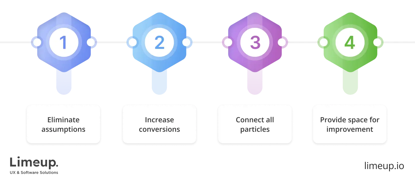
Eliminate assumptions and reduce decision time
Being guided by evidence-fueled decisions, the visionary specialists will be able to cater to several problems from the start. First, they won’t wander around, thinking of what could satisfy those who will choose the offerings in the future.
Leveraging the ideas formed from the different source findings helps a data-driven website design company deliver statistically guided outcomes faster, reducing the need to redo and guess.
Increase conversion rates
Considering not only aesthetics but the statistics, demands of beneficiaries, loops in the market, you can present a solution that your key segments will accept, since it will correspond to their needs. Namely, if your competitors’ navigation is too complex or not responsive enough, it can be resolved in your program when you hire UI/UX designers who know the ropes.
Connect all design stages with data
From ideation to development, all these stages are linked together, and their impeccable alignment is the key to a well-running website. When an interface is purpose-fused, it entirely changes the perception and performance.
To illustrate some data-driven design examples, Airbnb sticks to photo content because its visitors show interest in it, while Netflix arranges personalized movie icons derived from previous clicks.
Provide space for improvement
Finally, the greatest impact of datasets on the system is their unleashing power to make it better. Of course, if you agree to stop at this mark, it is possible to arrange a satisfying design.
However, with strategic inputs received from those who will benefit from it, your product will be capable of surpassing your biggest expectations and bringing fascinating improvements in the form of new leads and loyal customers.
In the following section, you will be presented with more about variables that are usually accumulated to make informed decisions.
What types of data should you use in design?
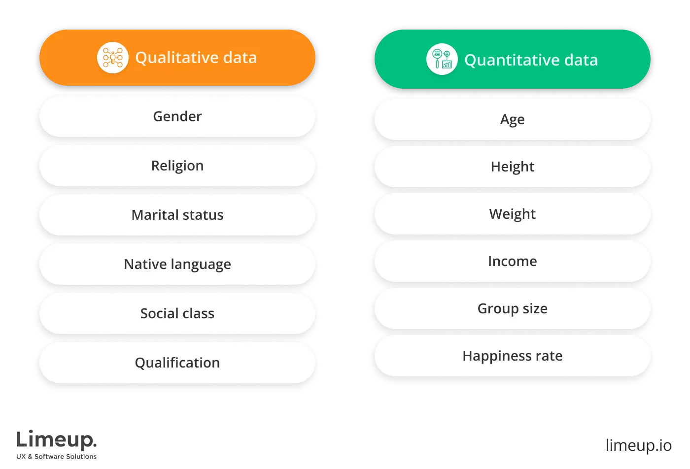
There are two main types to use: quantitative and qualitative. Each has its perks and benefits, but the best middle ground is gathering insights from contextual inputs and reinforcing them with numerical ones.
Qualitative data in UX design
This kind of statistic sheds light on why visitors behave in a specific manner. It enables us to thoroughly understand potential buyers’ motives, intentions, and attitudes. You can’t measure it in numbers as it’s subjective and collected through conversational interviews.
You explore their feelings and motivations from the perspective of the social sciences of sociology, anthropology, and psychology.
Case: When trying to explore an obstacle that stops the whole journey, analyzing countable records shows how many members ceased interacting with the interface, while observation explains why it happened, therefore allowing us to find informed resolutions.
For now, let’s refer to the leading methods of experiential assessment for creating data-design website design:
-
User Q&A sessions are conducted with a target representative, where specialists discover their expectations, motivations, how they cope with their workflow, and what they want to achieve.
You must ask open-ended questions and can add follow-up inquiries to get a complete picture. Also, you can read their body language to see how it aligns with their responses.
- Ethnographic sourcing is used when the tech enabler can observe how focus groups of potential beneficiaries interact with a deliverable in the natural environment. The investigator gets to see consumers in their context and identify new issues in real-life conditions. The obtained information will help bring a better data-design product design.
- A diary study is a type of survey in which participants must keep a record to сapture their thoughts and describe experiences regarding the object of inspection. Usually, this goes in terms of the set period. Therefore, it can be seen how engagement evolves with time.
- Usability check is reliable when assessing interface usability and effectiveness. During the examination, the tester tries to complete average tasks on the site page or app. The appraisers monitor the whole procedure and can ask additional questions. It can improve some existing features or compare them with competitors.
Numerous businesses prefer to partner and devote to exploring findings with experienced tech savants who have perfectly mastered insight-focused and UX design tools. This option is convenient because they provide competent professionals throughout the full production cycle.
Quantitative UX metrics
Numerical parameters are always objective, and this format includes only closed-ended prompts to turn one-word responses into numbers. It’s wiser to check these suggestions based on evidence methods.
The main methods for statistical logs include the following:
-
A/B testing is an experiment in which executors test two (or more) similar versions of the flow with slight distinctions to see which one works more effectively. The main objective is to decide what you want to track first and what will indicate the most suitable variant.
In particular, creating a strong CTA form can increase the conversion rate, and banners can grow the CTR using personalized customization.
-
Cards sorting is a kind of evaluation that allows experts to see how people classify information. Participants have cards with different materials or topics, and their task is to divide them into groups.
After comparing discoveries, a data-driven design agency can conveniently sort out content for platform members on the website or app.
- Analytics stands for measuring metrics, a popular method among web design studios. The tool tracks the performance and evaluates how and when members interact with your solution. With an intuitive interface and robust functionality, it’s easy to observe findings like page visits, number of clicks, time spent on interaction, etc.
How to build a data-driven design process?
Clive Humby, a British mathematician, once called information the new oil as it stimulates innovations as it was in the previous century. Despite that, before it’s refined, it isn’t as valuable. In this section, we’ll explain how a fine-tuned sequence of visual developments flows:
1 step: Define project requirements

You have to define clear goals and assess the current situation to build your strategy for the data-design web design. Reconsider your strengths and weaknesses to figure out how statistics can help you. Don’t settle on abstract targets; be specific and indicate exact numbers.
It’s essential to evaluate the required time for collecting information. Determine the deadlines that will help you assist in developing a plan. Ask yourself whether these ambitions are realistic and what kind of specialist should be involved.
When considering hiring one of the innovative companies for gathering input, write down your priorities and desired advancements before discussing your project. Here is an illustration of a well-defined milestone that may start with “I want to”:
- Increase the landing page conversion rate to 15%.
- Extend the time spent on the page to one minute.
- Reach a click-through rate of 4.23% on the CTA button.
- Boost newsletter signups by 10%.
2 step: Indicate the right area
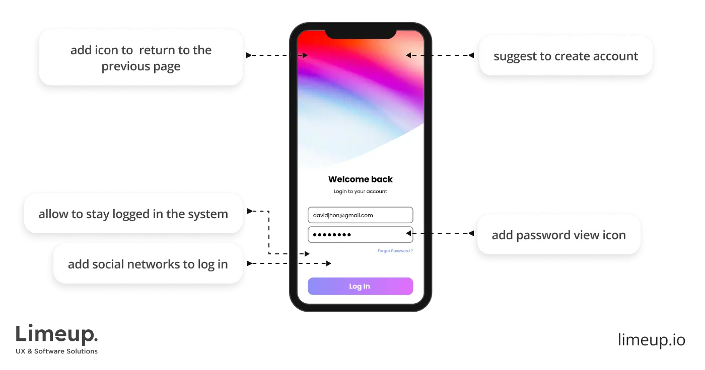
Data-driven design requires resources and time, so choose the most appropriate field for the test before you start preparation. According to your business aims, prioritize segments that need to be improved.
This can be a customer registration form, onboarding, or purchasing panel. If you need to reduce the number of clicks an individual has to succeed in their pursuit, work with the navigation section. Take into account the needs and hurdles of users. What are the areas of difficulty?
Gather datasets you already have, it can be feedback, metrics, ratings, or reviews. That will come in handy when comparing with later takeaways.
4 step: Get started with testing
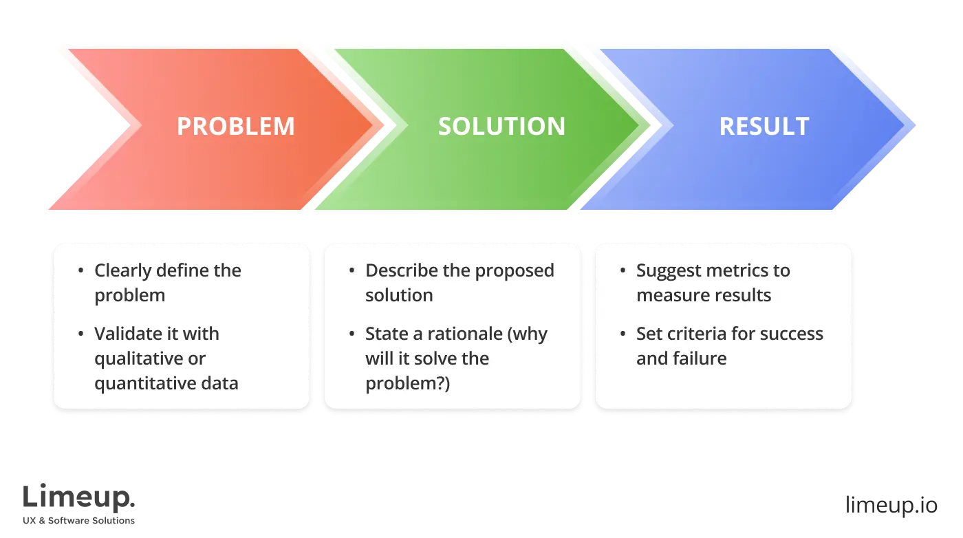
A hypothesis is an assumption grounded in an observation that can become true in certain conditions. For example, the points conclude, “If I do this, that will happen.” You can adjust it to your needs in any way possible, there is no standard form.
Such building structures our thoughts and works similarly in the UX design process. You shape ideas or identify issues, then, after obtaining details, start drafting a theoretical statement to figure out the right track and prove it with insights in the second part to validate it.
A correct concept should be:
- concretized,
- clearly defined,
- testable,
- matched with the purpose of inspection.
For a quick showcase, if you add a search bar, users will be able to find your offerings more efficiently. The content will be shared more often by adding social media share buttons.
4 step: Get started with testing
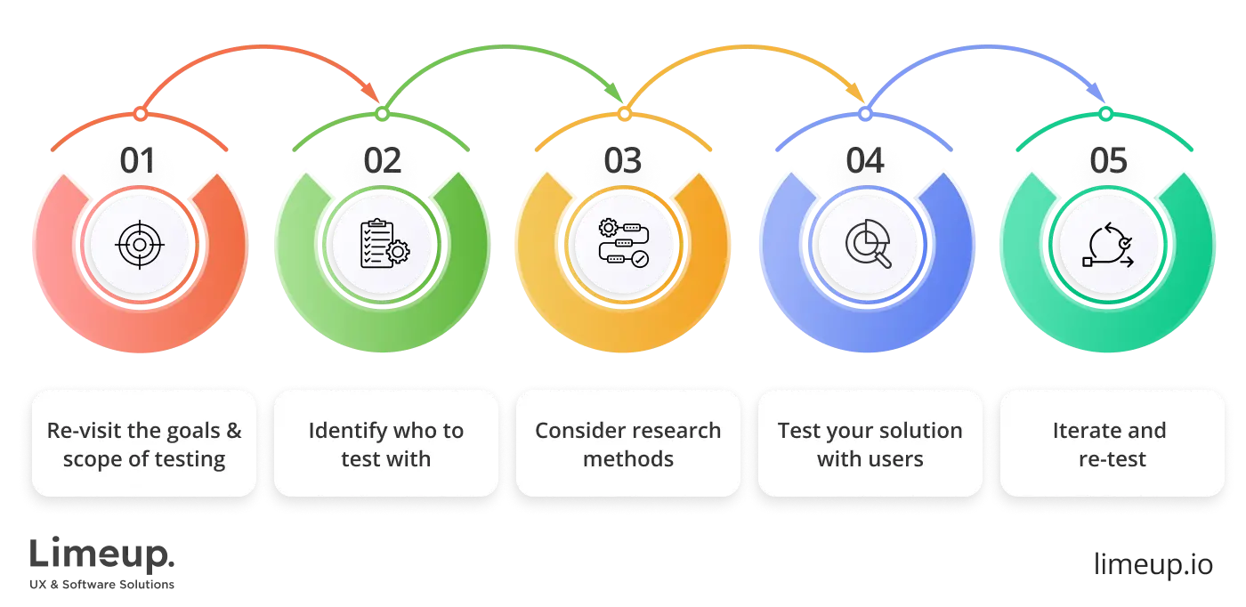
Each enterprise may have different policies due to record access, but collaboration between the visual creators and the decision support department is an established procedure. It’s crucial to convey what form it should be transferred, how often, and what entry type should be collected.
You will also need additional specifics for comparison. Namely, when the feedback states that there are 100 app visitors per day, to understand if this is a high or poor metric, compare it with your previous records and check your competitors or market standards.
Making such regular checkouts is crucial to achieving sustainable growth. Remember that figures are just indicators that should be used correctly. Avoid falling into the trap of endlessly checking performance.
What are the best practices in data-driven design?
Speaking of methodologies of curating the observations, there is a wide range of approaches to choose. We outlined the most effective in our synopsis:
Test with at least 5 users
Nielsen Norman Group debunked the myth that usability assessing ease of use can only be carried out on projects with significant budgets and observers. In reality, the opposite is true: the most significant results were shown by examination with no more than 5 participants.
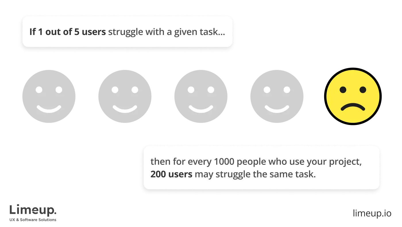
If you can test more than 5, then make several surveys with 5 assessors each. Sounds contradictory, doesn’t it? Zero testers give no outputs, but one provides a third of all the determinants you can learn about navigability, and so on.
The truth is that the subsequent visitors will have a tiny percentage of non-repeatable actions. Therefore, the more evaluators you add, the fewer new numerical logs you earn. Five is enough for one inspection to draw informative conclusions.
You have to involve additional reviewers if your website or an app has several different target audience categories. For instance, an online flower delivery shop has various key groups. Involving 3-4 individuals from each type is recommended.
Analyze unusual user behavior patterns
This particularly applies to interpreting numerical figures when you use analytics tools and notice rapid drops or bugs in interaction. Such factors should be addressed because they may have different reasons, such as poor optimization.
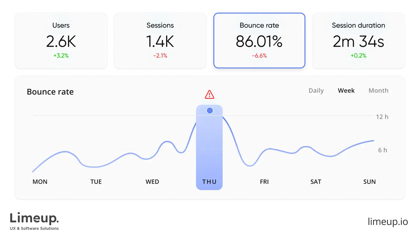
On the contrary, this signals that something is going wrong at this stage. The page may be too long to load, or the buttons need to be fixed. It’s essential to check and find the root of the problem.
In particular, using qualitative research when crafting a data-design UX design would demonstrate interaction behavior in real time so that you can see any possible bugs within the UI.
Choose the right data-driven design strategy
Drawn from our experience as UX design agencies in London with robust expertise, we can tell there is no typical solution for perfect data-driven design. Still, when completing an appraisal, you can choose among various creative strategies.
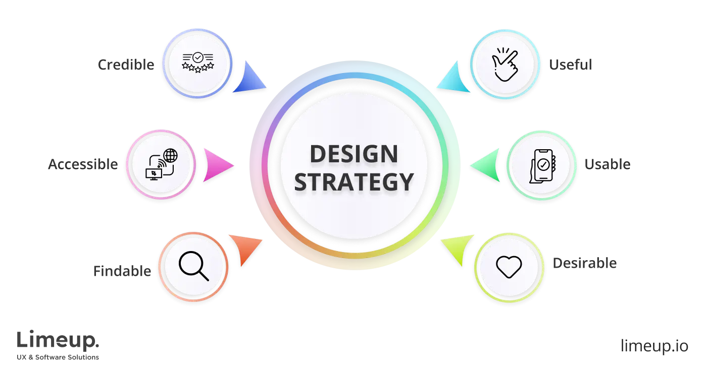
This tip will help you to define the engagement with the audience, predict the level of and satisfaction, and more.
Visualize data for better decision-making
There is no doubt that data driven design brings valuable resources, and you need to communicate this importance to others. 65% of people understand visuals clearly, so putting them in graphs, diagrams, and maps is worth it.
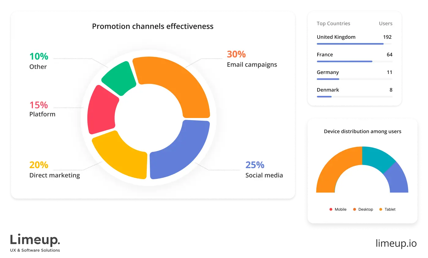
This will make it easy for everyone and assist your team in making the right decisions. You can always show successful cases of entities with such an approach or add proven statistics.
- Institutions with an evidence-based approach are 23 times more likely to attract customers and 19 times more profitable.
- Organizations that actively use quantitative and participant reflections are 3 times better at decision-making.
You may also have noticed that many firms now display account holders’ information to make interesting personalized selections and recaps. This has become one of the UX design trends used by Spotify, YouTube Music, and many other platforms.
Conclusion
After reading this blog post, you know the data-design definition and can evaluate and implement the gathered cues for more well-thought-out choices. Although it cannot give you a creative approach or an aesthetic vision of future offerings, it shows how the user perceives it and what they truly need.
Looking back at the research, you can draw valuable conclusions that will fuse further progress. Furthermore, presenting observations facilitates conceptualization, which is crucial for further development. To witness how it works in practice and benefit from it, contact Limeup.
Frequently Asked Questions (FAQs)
How do you build a data-driven design process?
Start by defining clear goals and selecting relevant metrics. Collect data through analytics, user research, and testing. Use insights to inform design decisions and iterate continuously.
When should you hire a data-driven UX design agency?
Hire one when internal expertise or tools are limited. Agencies are useful for complex products or scaling businesses. They help turn data into actionable design improvements.
What industries benefit most from data-driven design?
eCommerce, fintech, SaaS, and healthcare benefit the most. These industries rely heavily on user behavior and performance metrics. Data-driven design improves efficiency and user trust.
How often should data-driven design be updated?
It should be updated continuously as new data is collected. Major reviews are recommended quarterly. Regular updates ensure relevance and optimal performance.


