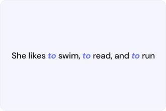
Parallel Construction Definition

Parallel Construction, which is sometimes referred to as parallel structure, is a method deployed in writing and design for the sake of good order that makes elements of the same kind form a pattern. It is by using the same grammatical or visual format for similar ideas that the content is made to be more readable, comprehensible, and navigable.
In writing, parallelism guarantees that connections, enumerations, or individual statements observe the same arrangement. In the visual realm, the systematic placing of elements across the page has the same effect as making the content logical and pleasing to the eye. The underlying idea is to draw attention to the points of similarity and the connections among ideas; the overall clarity and the quality of the user experience are enhanced.
Why Parallel Construction Matters
Utilizing parallel structure across writing and design definitely influences the rate at which users perceive information correctly. Content that adheres to a certain rhythm is not only easier to comprehend but also more interesting. The main advantages are:
- Enhanced readability. Information gets processed by the users much quicker if it is presented in a similar manner to how thoughts are.
- Coherent messaging. The surrounding meaning of the terms is at least as strong as the connection between ideas through parallel wording.
- Better design flow. Users can easily scan and navigate through visual components placed consistently.
- Stronger engagement. Comprehensible content is more attractive to the audience.
Having secured the match in the text and design elements, you make sure that your content not only has clear ideas but also gives a good impression to the users.
Best Practices for Implementing Parallel Construction
Making content and designs use parallel structure necessitates the utmost care and uniformity throughout the process. For clarity and effectiveness to rule over everything, the following approaches can be adopted:
- Verbs, phrases, or sentence structures in lists and comparisons should be aligned.
- Tone and format of headings, subheadings, and bullet points should be kept consistently.
- Disk patterns for buttons, icons, and visual blocks should be applied uniformly.
- Content should be reviewed for sections that mix different styles or structures and subsequently standardized.
- Readability and visual flow should be tested to make sure that the users can effortlessly follow the information.
If you follow these practices, you will have not only created an intuitive but also a visually appealing and user-friendly content, which, in turn, will lead to better engagement and comprehension.