Liquid Layout Definition
Liquid Layout refers to the layout (template) of a web page. Since any website is visited by people from different devices, with different horizontal browser window widths, web development technologies try to cover all these needs.
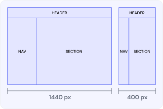
This type of layout uses relative units of measurement in CSS styles instead of fixed units. Typically, “liquid” template layouts use percentages instead of pixels, but relative units such as em (proportions for the font), vm (1% window width), vh (1% window height) are also gaining popularity.
Such layouts are designed to bring many benefits, mainly so that the entire site page fills the entire width of the screen, regardless of its width. If the device window is very wide, some content may look too stretched. Conversely, on a small screen, the content of several columns may not fit completely and will be practically unreadable.
Advantages and disadvantages of using a sparse layout
Sparse layout is widely used in the context of various fields such as software development, UX design, urban planning or data storage but we will consider advantages and disadvantages in terms of UX design.
Advantages:
- Optimized resource utilization: efficient use of resources is essential and crucial point that allows to minimize wasted space in memory allocation within software development.
- Reduced costs: leading to this point we can associate it with previous benefit since it’s interconnected with infrastructure development, maintenance, expansion.
- Room for growth and adaptation: such a solution provides flexibility and scalability to accommodate changes over time like additions to software features.
Disadvantages:
- Lower data density: it can typically result in such cons which is not conducive to maximizing efficiency.
- Possible data isolation: since data points may be logically distant from each other it can lead to data isolation.
Liquid Layout use cases
Liquid layouts have the ability to smoothly adjust to various screen sizes, thus making them suitable for a particular realm of web development. The following are the major applications that are common for web design:
- Full-width sites. It is used to maximize the reading space and visibility to users.
- Interfaces for dashboards. They choose liquid layouts for its benefit of allowing charts, tables plus widgets to expand to the screen size.
- Spreadsheets. Working with large tables of data, this template prevents horizontal scrolling and allows columns to manage their sizes proportionally.