Kerning Definition
The kerning helps control the distance between some sets of letters, making their display equal and readable/distinctive enough in appearance. This function differs from letter spacing since it focuses on letters selectively, namely on all possible letter combinations that seem unusual due to equal spacing, traditionally consisting of “AV” or “To,” and increases/decreases the distance between the letters accordingly.
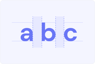
To define kerning, it’s important to realize that our eyes see different amounts of space based on the letterforms involved. The presence of an “A” followed by an “V,” for example, will necessarily increase the amount of white space between the letters because of the angles, whereas the letters “nn” are gathered together more tightly.
Kerning adjusts these differences, allowing the space between letters to feel balanced within a word, even if it doesn’t necessarily measure the same all the way along.
Why kerning matters
It’s the method that enables the designer to control how professional, how polished the text is. Bad kerning is very obvious: letters collide, crash, and then just sort of drift apart in an unpleasant, awkward way. Good kerning means that words flow.
Proper kerning has an immense, yet very subtle, impact when it comes to the matter of readability. Kerning that comes with perfection helps consumers read words with ease, while improper kerning causes one to read with less speed because the brain has to put in extra work in recognizing letters through distinct shapes.
Where to apply kerning?
Kerning becomes important in the following conditions:
- Headlines and titles. Larger text shows spacing errors, which are obscured in smaller sizes.
- Logos and trade names. Visual identity needs flawless letter relationships.
- Typography. Fancy fonts usually need to be fixed manually.
Kerning is rarely modified in modern fonts for body text as they go with common pre-built letter pairings.