Color Definition

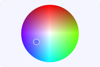
Color is a term used to describe the visual perception of light that we can interpret into various colors. Thereby, reflecting the light in our eyes, we can perceive colors and that is where psychology comes in handy, opening the variety of shades.
Talking about the role of color in UX, we can definitely say that it’s essential to represent your business with custom shades to make the user experience smooth.
Color is highly interconnected with psychology, not just physics, especially when it comes to the tricky question of UX design. Implementing a well-thought-out color approach, you can reach more user engagement. Talking about colors in UX, we mean not only palettes but accessibility within color theories that work for all people around the world.
Impact of color choices on user behavior and accessibility
Going beyond primary perception, color has a profound impact on people’s emotions, the way they decide, and their interaction patterns, thus influencing the users’ interpretation of the interface elements like buttons, alerts and navigation cues.
Proper color application can attract attention, set up the visual hierarchy, and lessen the cognitive effort by allowing users to know fast what actions are available or important.
On the other hand, UX color design that is effective has to consider the accessibility standards at the same time, such as the contrast ratios that are good and the combinations that are friendly for the color-blind, in order to provide inclusivity.
The differences in cultures regarding color interpretation are also a factor, as one color might represent trust, urgency, or caution in one region and the opposite in another. When used wisely, color turns out to be a UX tool that not only improves the visual aspect but also the usability, clarity, and overall product credibility.