Dashboard Design: UX Principles and Best Practices (2026)

Dashboard design is one of the most essential points when it comes to the data visualization process. To produce a successful panel, it is necessary to follow the fundamental principles of UI/UX so our experts have created this article to highlight the useful data that plays a crucial role in the performance of the project.
We will cover the dashboard design best practices, what this term means, how to design one in a 5-step guide, and more. The layout for consoles is one of the most effective ways to display data and related information and in our summary, you can get acquainted with the details and expand your knowledge.
Learning about designing dashboards and having a full understanding of the principles behind data illustration is becoming incredibly important nowadays, as choosing the right methodology is critical to your progress toward your goal, and our review will shed some light on these issues.
What is dashboard design?
While we are stepping into the subject of designing dashboards we can’t leave behind the term meaning — to talk in a nutshell it has become a trending topic to discuss in different outlines in recent years. However, many businesses are still not aware of the usage and how it can be implemented. For this reason, we are offering this theoretical article starting with the definition.
The best dashboard design is created for a visual display of data consolidated within a single monitor. By visually representing essential information, you make it easier to understand and allocate your time and money resources.
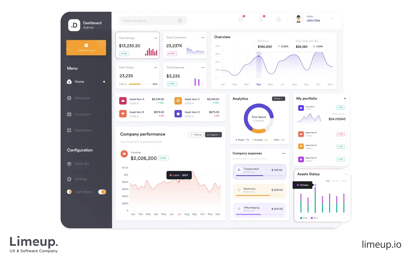
As for readability and intuitive perception, consoles have to be represented with a single glance. Since they are highly customizable, you are able to control their content to make it within an array of techniques — bar graphs, tables, color coding, widgets and gadgets, annotations and callouts.
Following the advice of your UX consultant, keep in mind that the leading advantage of panels is to represent the visual part of data within various graphic elements. You are transforming raw information into actionable insights, making complex things easier and more accessible. Effective instrument boards simplify the data analysis process.
Subsequently, the flexibility of good dashboard design has the ability to draw and serve the main purpose — to make critical business decisions based on a data-driven approach.
There are also a number of possible variants of control panels — according to your business needs and purpose, for example, marketing, operational, performance, strategic, HR and others. Each of them focuses on a particular topic catering to users’ needs. Let’s take a closer look at the main ones that can be offered by UX design agencies in London or other regions.
Main types of dashboards and their use cases
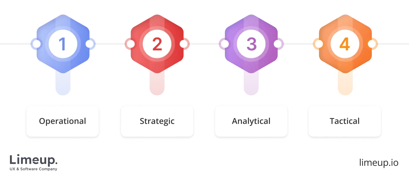
In general, there are four categories with different purposes, and therefore, with disparate indicators that will be measured in the process. To understand the specifics of dashboard designing services in more detail, let’s dive into the review of the main types. This will help make the choice easier when it comes time to decide on the type of services.
-
Operational. They represent a general overview of business goals, but are used to track activity in a specific area and inform the owner about what is happening at a particular moment. You can analyze input data and results in parts, detail key metrics in real time, which allows you to take the needed measures immediately when necessary.
Case study: if you are a company manager and want to monitor the implementation of a project step by step, then such a keyboard will allow you to see all stages from time control and budget management to sales team income and invoicing.
-
Strategic. Required for any business owner or senior manager. This is a kind of bird’s eye view to quickly assess the overall state of the company. As a rule, they offer high-level performance metrics (competitor results, historical data, and set control levels). In these cases designing dashboard consoles are also suitable for forecasting performance in a certain period.
Case study: imagine that your goal is to triple revenue and halve customer churn. Then your reporting would include actual and target revenue for the month, goal achievement, and comparison with the previous year.
-
Analytical. Use data visualization to delve into history and identify and predict trends. The main difference is the level of analysis and the data set with a large number of filters, views, visualization types, which is reflected in the design.
Case study: if you have a SaaS application for a call center, you will need the ability to interpret the number of sales calls, agent productivity, average call duration, as well as traffic without involving outsourced specialists.
-
Tactical. It is not a simple dashboard design for deeper analysis with specific interpretation of processes and provision of detailed reports on projects and goals. Typically used to process a large array of data, examining specific points with filtering and segmentation. The result is the discovery of patterns and opportunities for advancement.
Case study: an expert in one of the fields decides to analyze his direction in terms of efficiency and growth prospects and chooses a tactical panel, which allows him to plan long-term goals.
Based on the format of your business and its focus, it is worth choosing one of these varieties. To operate intentionally, a composition has to be tailored and meet the requirements of end-users — answer their questions, serving as a tool to track how well the company meets objectives and business goals.
Why does dashboard UI and UX design matter for business?
Most overviews say that a simplified way of data visualization and performance is essential for every business — you can make critical decisions and assessments. Since you are able to present a large quantity of data, thereby you are able to represent better results within your product or service operation.
There are a multitude of reasons why implementing instrument boards is a perfect concept for gaining momentum and providing a holistic view of your company’s operations. We will consider the most unobvious ones about dashboard design ideas that can’t be tracked by the untrained eye:
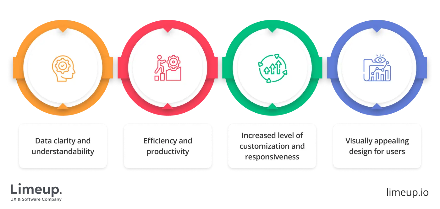
Improved data clarity and understanding
Ensure that the interface is intuitive and clear, so that users are able to quickly grasp the layout, navigate through different visualizations, and easily interpret the presented data without any confusion.
Therefore you can’t ignore accessibility — designing an interface you have to consider novice users and provide sophisticated tools for advanced users. We mean tooltips, documentation, customizable features, etc.
Higher productivity and faster decision-making
Using dashes for UI and UX design you can improve the named options by streamlining workflows, optimizing cognitive load and allowing users to focus on representative data. Further, your workers will be able to make more informed decisions instead of wrestling with the interface and user experience.
Customization and accessibility for different users
Since every person has their own requirements for website dashboard design, you are able to present them with such a solution — including drag-and-drop functionality, adjusting the visual part, etc.
Moreover, the responsive UX design of your instrument proves seamless adaptation to different devices — users can reach the control panel using tablets, PCs, or smartphones.
Visual engagement and user satisfaction
Paramount features are essential, still, don’t forget that users have to easily perceive your data to drive insights. Therefore you can capture users’ attention and maintain their interests in the control panel through the use of various tools.
For example, in dashboard UX design, you can use icons, typography, and innumerable data visualization techniques — tables, graphs, or else to present not a bland panel but visually appealing UI and interactive user experience.
In summary, in terms of UI and UX it’s essential to create user-friendly interfaces that are simultaneously attractive and efficient. You have to prioritize clarity, accessibility, and a high level of customization so that you will reach the highest tier of user satisfaction and drive positive outcomes for your service or product.
Key principles of effective dashboard UX design
Experience shows that people respond faster to images than to text, which means that a successful interface layout can largely determine the user experience, which in the long term affects the success of a website or application.
Although dashboard design key principles are not something immutable, there are still certain principles that allow you to extract the maximum benefit from data. These are the brief ones we want to tell you about.
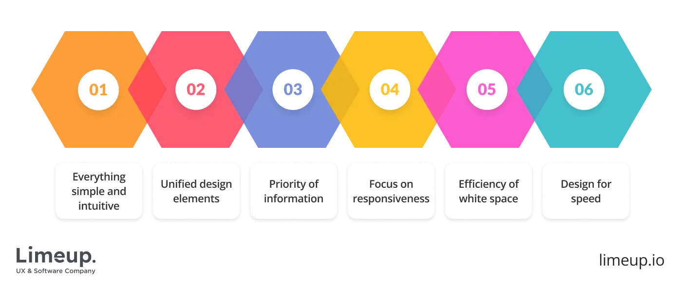
Make everything simple and intuitive
A dashboard ought to be simple to comprehend immediately. The use of minimalist design enables the users to faster identify the information they want. Do not use a lot of elements since users can easily get confused and consequently stop interacting with the dashboard.
Clear terminology, logical classification and user-friendly navigation are the inputs to a smooth experience. Besides, simplicity speeds up the process of making decisions and allows for an easier adaptation of new users.
Unified design elements
The get-up of the dashboard has to be consistent like a person’s character. It is a way of doing things that create recognition and trust. All the fonts, colors, icons, and visual styles should be in the same manner throughout the dashboard.
By using the same design elements, a nice and smooth appearance is created, which allows the users to concentrate on the content instead of being confused by different styles. Furthermore, the same visual traits are not only a sign of an intuitive navigation system but also a factor that makes it quicker and easier to train or onboard new users.
Priority of information
Data that is most essential should be presented at the forefront. Customers ought to get the necessary statistics right away and not have to search for them through the interface. It is recommended to use visual signals such as dimensions, colors, or locations to indicate the key performance indicators (KPIs) most clearly.
The proper arrangement of the data, the combining of the related metrics, and the setting of the most significant cards at the top all contribute to the users’ quick and informed decision-making.
Focus on responsiveness
This has become a main factor in dashboard design UI in this era of mobile devices, which necessitates adaptation to various sizes and resolutions of displays. The increasing usage of mobiles and tablets requires the implementation of a flexible grid system, media queries, and scalable elements to guarantee that the interface adapts with no interruptions.
Don’t include small details that will be difficult to see on smaller screens. Responsive design enhances accessibility and gives users the freedom to communicate with the data at any time and from any place.
Efficiency of white space
White space is not wasted space but a graphic design tool. When used properly, it can highlight key facts, divide different parts, and make the text easier to read. It gives an impression of organization, lessens the mental effort required, and quietly directs the users’ sight all around the dashboard. Good use of white space concurs with visual weight and legibility.
Design for speed
Performance has a direct influence on user retention. Research indicates that a site that takes more than 3 seconds to load will lose about 53% of its users. So, dashboards are to consist of light images, files that are compressed, and code that is well optimized.
Lightning-fast UIs make users so happy that they come back again and again, thus making the dashboard not only aesthetically pleasing but also functionally excellent.
Enhance interactivity
Dashboards must have interactive features such as filters, drill-downs, and hover-over details. Interactivity gives users the power to explore data in their way, reveal insights, and tailor their experience. Careful interactions foster engagement and enhance the significance of data exploration.
Visual hierarchy and color coding
Utilize hierarchy and color deliberately to influence attention. Major metrics ought to be portrayed in contrasting colors or on bigger cards. Gentle colors may signify auxiliary or less important data. This approach enables users to rapidly scan the dashboard and comprehend the connections between the metrics without any misunderstanding.
We have covered the key principles, but it is also important to remember the consistency of the layout of elements, regular updates, and maintaining the accuracy of data and sources. And then your panels will be invariably popular with users.
How to design a dashboard: step-by-step UX process?
Since you expect standardized creation, here we are going to inspect the development process of a console within basic steps. However, not every business owner is familiar with what is involved in the nuances of building.
We will explain it in understandable terms below so that you can realize what to expect from these steps and how to develop a control panel that meets your expectations and business needs using key dashboard design principles. For now, let’s jump right into the stages.
Understand your dashboard users
Successful dashboard UX design starts with understanding who will use the dashboard and what data matters to them. Building a clear user profile helps determine which insights deserve attention and which details add noise.
What makes a good dashboard at this stage is simplicity: information should feel accessible, well-visualized, and directly connected to user goals.
Define clear dashboard goals and objectives
Clear objectives guide both data selection and interface structure. Each element, from filters to drop-down menus, should exist for a reason and support a specific task. Design for dashboard work improves when data is contextualized with explanations that help users interpret results instead of guessing their meaning.
Choose metrics and KPIs
Key indicators must remain measurable, reliable, and aligned with business priorities. Focusing on essential KPIs such as revenue, conversions, or leads prevents information overload and keeps attention on performance drivers. A good dashboard tracks progress without burying users under secondary metrics.
Visualize data effectively
Visualization translates raw data into insight by showing relationships, patterns, and trends. Charts, graphs, heat maps, and rankings help users understand information faster than tables alone. Combining static and interactive elements strengthens UX dashboard design and supports deeper analysis.
Optimize for responsiveness and accessibility
Dashboards should function smoothly across devices while remaining accessible to all users. Testing for speed, layout behavior, keyboard navigation, and screen reader compatibility ensures usability stays consistent. Continuous iteration based on usage data helps refine design for dashboard performance over time.
To create the perfect panel, use the basic principles we have described above and always keep in mind the needs and objectives set at the beginning of the creation process.
To create the perfect panel, use the basic principles we have described above and always keep in mind the needs and objectives set at the beginning of the creation process.
Best practices for modern dashboard design
You may be wondering what can improve the development process since it’s an extremely crucial point in business operations and discovering in-depth insights about how your product or service is performing on the market.
By conducting rigorous research you are able to unveil the best practices and look at UX design trends so here are the leading things to pay attention to when designing an instrument board.
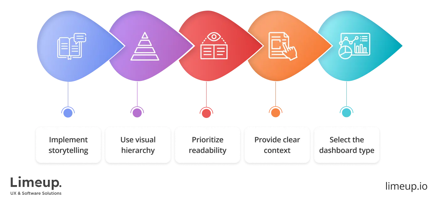
1. Use data storytelling to communicate insights
This point refers to KPIs and metrics choosing and therefore, you have to tell a story using the data, thereby effectively representing data using visualization for performance indicators. Storytelling is a powerful tool for conveying complex data into a visually appealing console using real-time data.
Since forward-thinking businesses have to represent their data effectively, storytelling in dashboards design is essential. You have to build a bridge between the presented information and how it will be perceived by end-users, and storytelling is your robust tool.
2. Use visual hierarchy
Since you have to guide end-users’ attention it’s essential to establish a clear visual hierarchy. Ensure to arrange visual and text elements — titles, headings, logical order of visual parts, what content is represented.
One of the easiest ways to highlight essential data or elements is to use font size in dashboard UI design. Another point stands for choosing colors wisely — strategic implementation to highlight key data, keep it from overwhelming and detracting from readability.
3. Prioritize readability
Ensure that the process is conducted according to clear and legible fonts — right font sizes, the visual part is not overcrowded with visual elements and annotations are available and easy to read.
When choosing fonts for dashboard UX design remember to represent your specific style of data, consider your tone of voice, what type of infographic you will be using in constructing the keyboard. Don’t be afraid to experiment with fonts and sizes, your goal is to make the text the most visible and readable.
You can even use comic fonts, it’s essential for them not to be the same so that you can style your text and simultaneously not be very different since it will confuse your end-users. Find web-friendly fonts and, based on our experience, it would be perfect to implement two or three different fonts that are interchangeable.
4. Provide context for accurate data interpretation
Whether you are preparing elements for full-fledged data visualization, it’s cool but worth nothing without clear context and insights. Help users to interpret visualized data by adding relevant content, highlighting essential parts of statistics, and you can also enable interactivity.
Implement not only the visual part of your UI dashboard design but also incorporate filters for statistics, dropdown menus, and various functionalities that allow users to operate your data. Thereby you help users to interpret the provided information filtering out irrelevant data, uncovering deep insights about your solution, etc.
Remember that you are representing a visual display of complex data — consolidate and arrange it within one or a few screens considering clear context so that users can receive maximum out from your console.
5. Choose the right dashboard type
Since there is no one-size-fits-all answer for a type in designing dashboards that will be perfect for your business, you have to consider your business needs and expectations. Each of them is focused on platform-specific analytics, so the receiving user has to be assured that the information is created according to their needs.
When properly implemented a dash can be used for receiving in-depth information about a product or service so ensure that the type reflects what is needed — shorter or longer timeframes, vast or simplified amounts of data etc.
We have outlined only the most essential UX dashboard examples but remember that it’s an intuitive process powered by checked methods of performing. You can implement one, two, or all practices if it’s needed — the more is better since each of them aims to improve your invention.
Summing up
UX dashboard is a user-oriented way to present essential data that covers your business objectives and needs. Using this method you are able to come down to diligent development of control desks and understanding users’ true desires — clear context, in-depth understanding and insights, etc.
In our detailed guide, we have tapped into what stands for the right work-line, the steps you need to take when creating one and what the best practices are according to your unique business needs.
If you would like to receive a consultation about dashboards design, you are welcome to contact Limeup and we will schedule a complimentary meeting to discuss your expectations. We are experts in crafting user- and web-friendly utilities that help you to reach your full potential.
Frequently Asked Questions (FAQs)
How long does it take to design a dashboard?
The typical duration for dashboard design is from 4 to 12 weeks, but it varies based on factors like complexity, the number of screens, interactivity, and whether user research or prototyping is part of the process. Simple dashboard designs can be finished in a shorter time frame, while dashboards for large enterprises with sophisticated analytics might take longer.
What factors affect the cost of dashboard design?
Initially, costs are dictated by the dashboard’s range, number of screens, interactivity, data integration difficulty, and the designer or agency’s expertise. Moreover, factors such as mobile compatibility, tailor-made visuals, and continuous updates or maintenance also play a role in the overall cost.
What are common mistakes in dashboard design?
Some of the most common errors are messy layouts, diverse and contradictory design elements, poor data hierarchy, wrong choice of color or typography, not caring about mobile responsiveness, and so on, which causes users to be overloaded with information.
How many metrics should be included in a dashboard?
The exact number depends on the use case, however, a dashboard typically shows 5-15 significant metrics for each page. To prevent users from being overwhelmed and to enable insights to be instantly actionable, give priority to the KPIs that are the most important.
What is the difference between dashboards and reports?
Dashboards are a way of giving a real-time, visual summary of key metrics for quick decision-making. Reports are generally static, highly detailed, and intended for analysis over a longer period. Dashboards are mainly concerned with monitoring; reports provide in-depth insights and historical trends.

