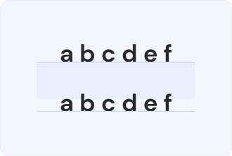
Leading Definition
In information technology and design, “leading” is a common term for everyone working with printing, as it simply stays for the gap between two sentences in vertical lines. When reading a book or an article (even this page), you definitely notice that the spacing is defined by designers, making it easier for visitors to read.
To make it more specific, we can say that it’s vital for people who look for accessibility as they don’t want to harm their eyes yet would like to still read the information using the benefits of the digital world. Whether using Figma, Adobe tools, InDesign, or website constructors, you will be working with leading as a concept.
As a complex term, it also requires being aware of different font types to know how they can be aligned, color contrasts, and other nuances. Speaking of the leading, it goes in two variations — tight and loose.
What is the role of leadings?
There are no insignificant elements in designs and leadings prove this idea as its impact as follows:
- Increasing readability. No matter how beautiful the font is or how important the information is, when the leading is neglected, the reading becomes a quest that you want to finish as soon as possible, leaving negative impressions.
- Setting the right aesthetics. When you build a brand and try to make it consistent, you consider gaps between lines as well. Depending on your brand persona, the distance can be bigger or smaller. You can often see that tech companies use bigger spaces to create a futuristic atmosphere.
- Spotlighting the hierarchy of the text. The people who will read your texts will grasp the idea better with the right leadings that separate such components as headings, quotations and paragraphs. The emptiness between lines is a basic element that impacts how readers perceive information.
Tips for balancing leadings
Here are some practical principles that will help you create accessible materials and satisfy those who will read them:
Don’t make it too tight
When the text you present has a very small distance between the lines, it poses an inconvenience for readers. They can find it difficult to concentrate their attention on information (it becomes a real problem if the writing is industry-focused or academic). Instead of staying on your website or reading your print materials, customers will try to look for alternatives.
Don’t create too loose leadings
On the other hand, if you opt for a loose option, it won’t be the best solution if the gap between the lines is abnormally long. There are no standards regarding leading in design and typography. To maintain proportion, it is wise to test its look on several devices and in a printed version.
Adapt them when changing fonts
What works for one case doesn’t always apply to another. If you need to make the font bigger or switch it, especially if it comes in a different style, check the visual appeal of a new choice. It may happen that default settings don’t suit your brand mood.