Bubble Chart Definition
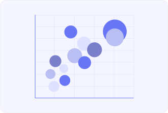
Bubble chart – is the graphical representation of data with circles or bubbles on three sets of numerical data within one plot. Each bubble is representing the only datum for which a value is given in both horizontal (X-axis) and vertical (Y-axis) coordinates. Further, the size of each bubble shows the third measure. This type of chart is able to show a great amount of data and at the same time indicates the relation of three dimensions from its elements.
Optionally, it might use color in order to code other categories for ease of reading. Bubble Charts are capable of finding applicability in the widest area range, starting from finance and economics to other comparative analysis of dynamics of data and trends forecasting. It does so by speeding up the rate with which correlations are determined and unearthing the spatial distribution of the data for further understanding.